Results tables that can be analyzed further have green grids (in contrast, tables with red grids cannot be analyzed further). There is no limit to how many analyses can be chained together in this way. When you edit or update the data table, Prism will update the entire analysis chain automatically.

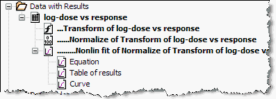
At the top of the Navigator, you'll then see The Data with Results folder, which shows results nested underneath the corresponding data tables. Analysis chains appear as a series of indented sheet names. In this example, data are first transformed, then normalized, and then fit with nonlinear regression.

You can choose to hide the Data and Results folder or to show it always, even when you haven't created any analysis chains. These choices are in the View tab of the Preferences dialog.